Megapolis+
txt
Megapolis+ is a 22-year-old international advertising holding rooted in Kharkiv, Ukraine — the birthplace of the Ukrainian avant-garde and constructivism.
For the brand system update, we returned to that origin: to Vasyl Yermylov's modular letterforms and geometric rigour. The result is a logo family built on a single circle unit, a typography system derived from constructivist proportions, and usage rules clear enough for a 750-person organisation operating across Ukraine, Poland, UAE, and Saudi Arabia. A system that finally works as hard as the company does.
tsk
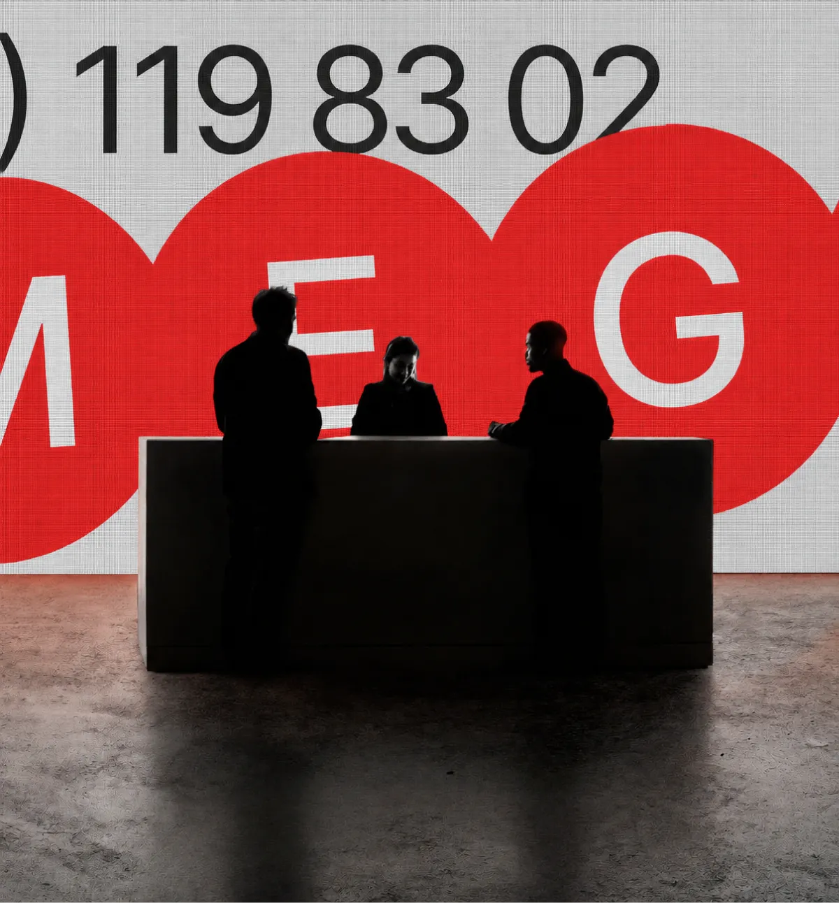
Our task was to develop a flexible and cohesive design system and create an identity that feels urban, contemporary, and dynamic.
It should also incorporate a strategy for developing complex physical brand applications for large companies.
ppl
- Vlad Buivol
- Valeriia Hencheva
- Ryha Anastasiia
- Dmytro Kozynets
- Kateryna Yesipova
- Liza Sipko
- Snizha Honcharenko

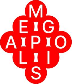
- LOGO
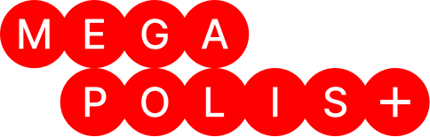
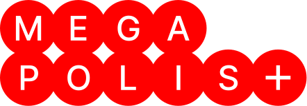
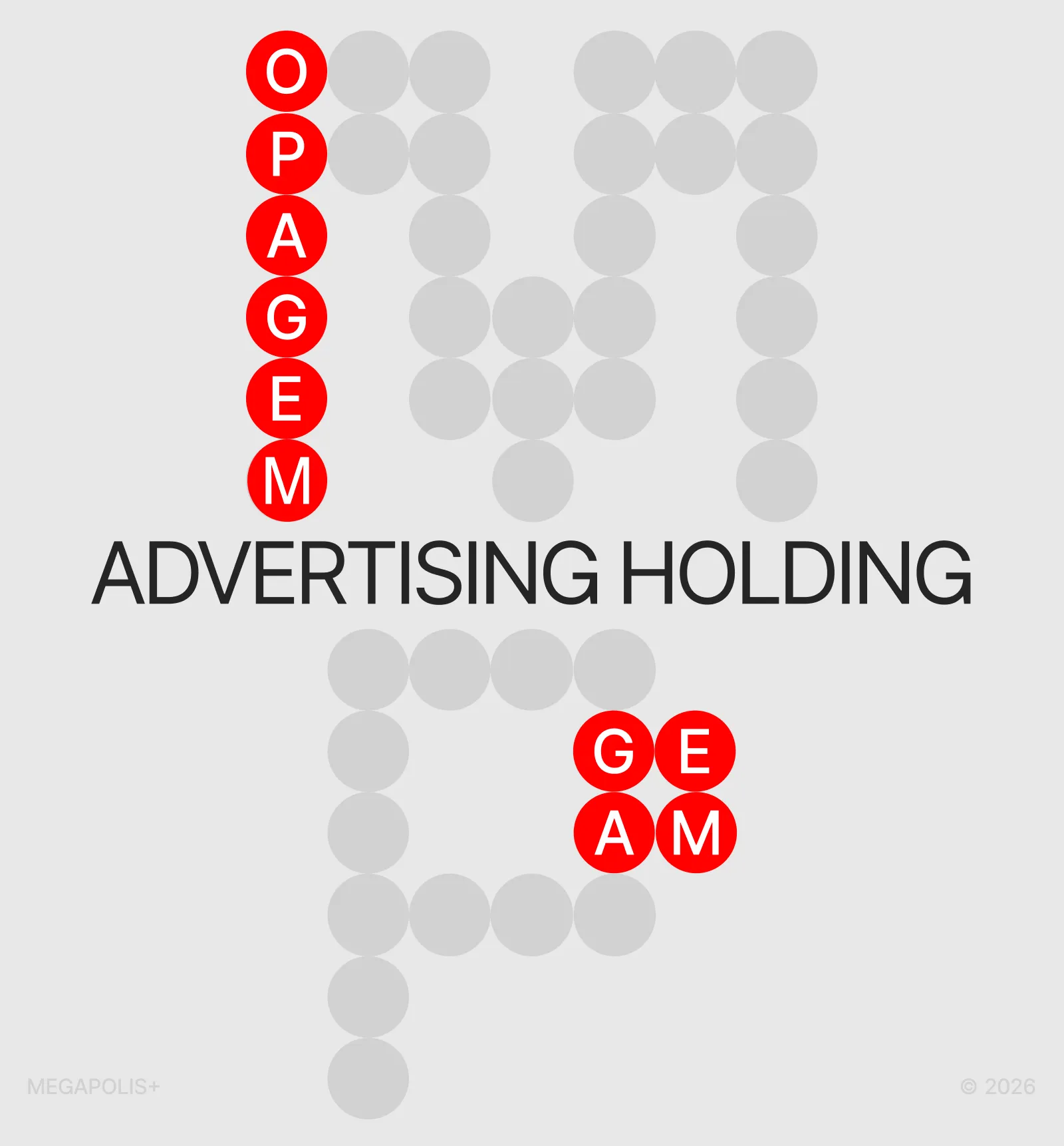
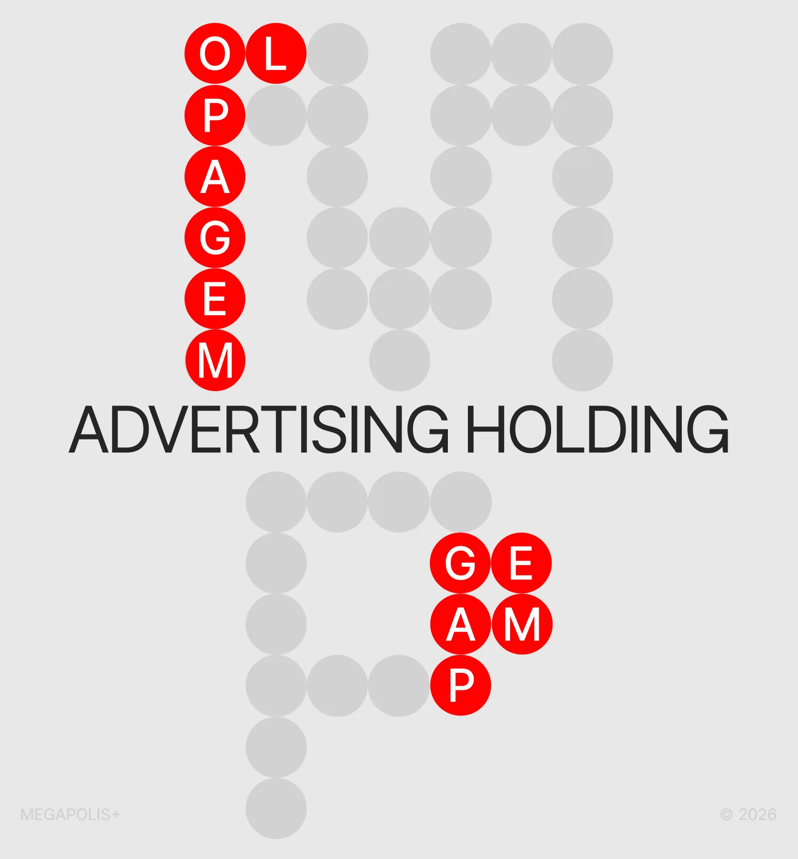
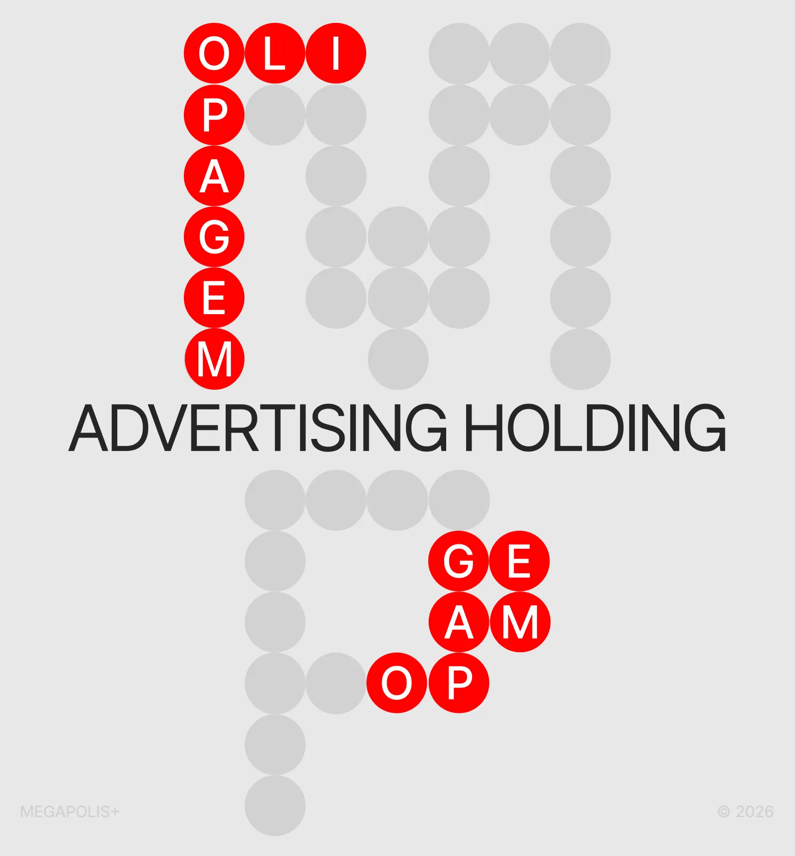
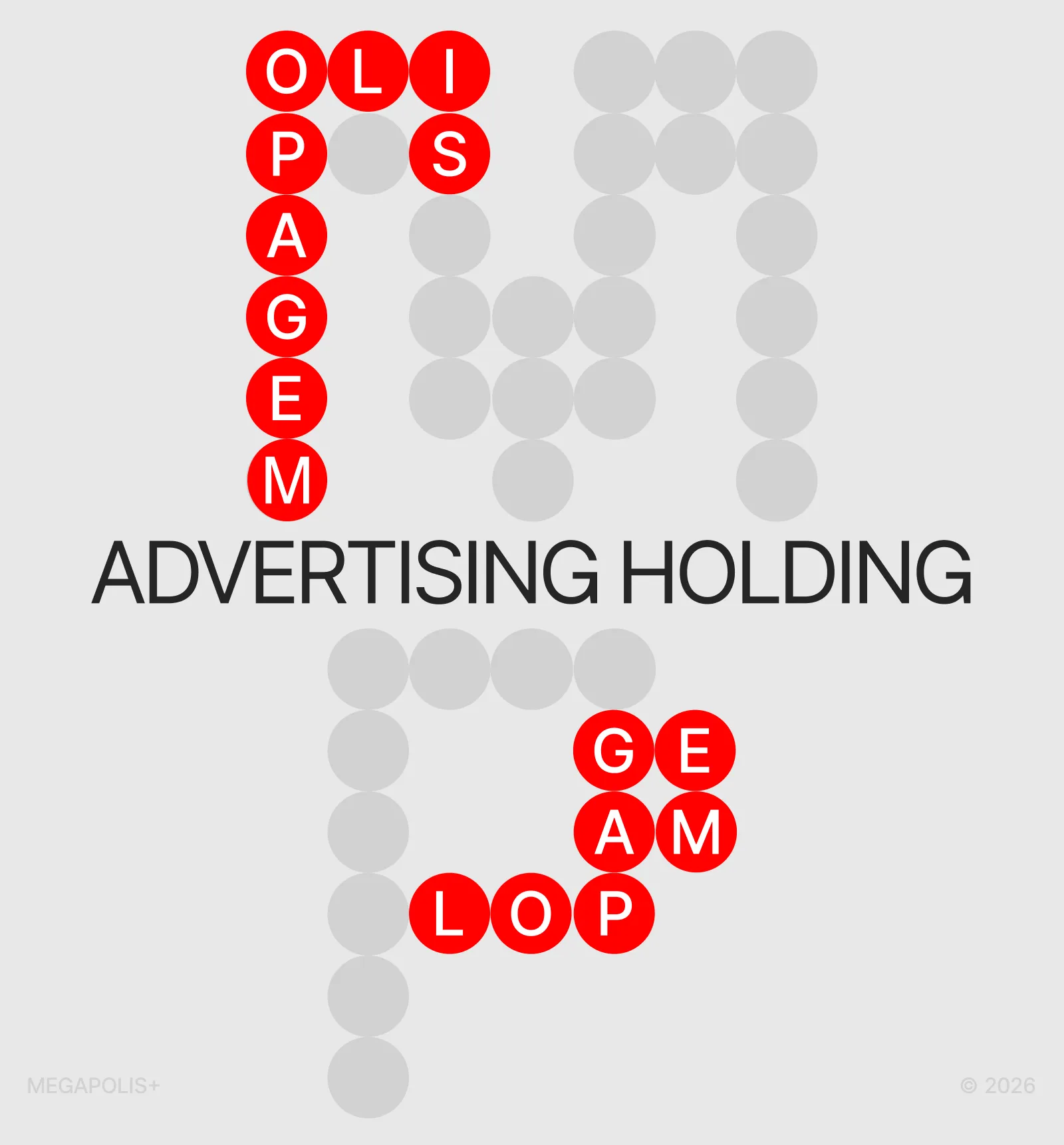
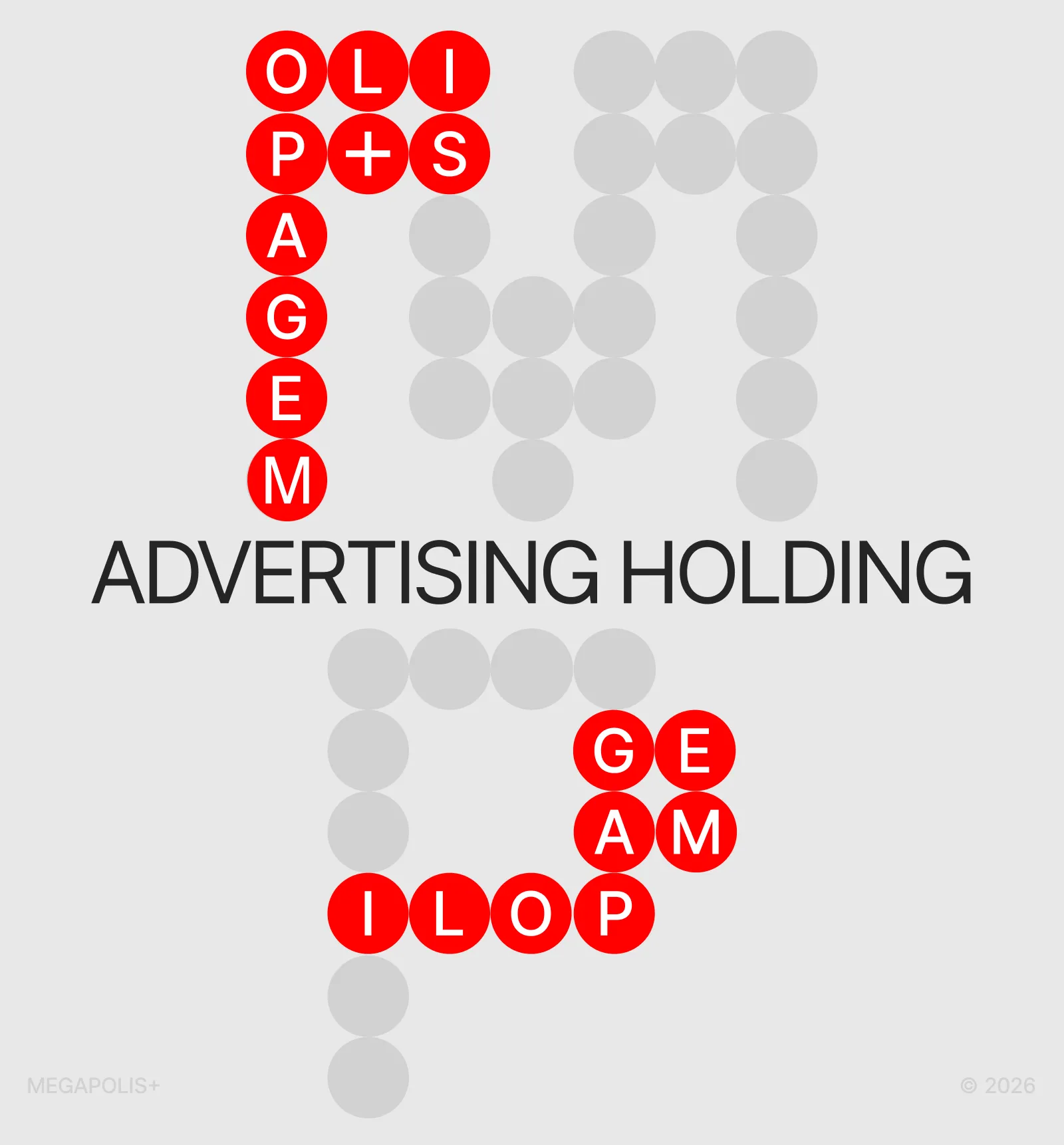
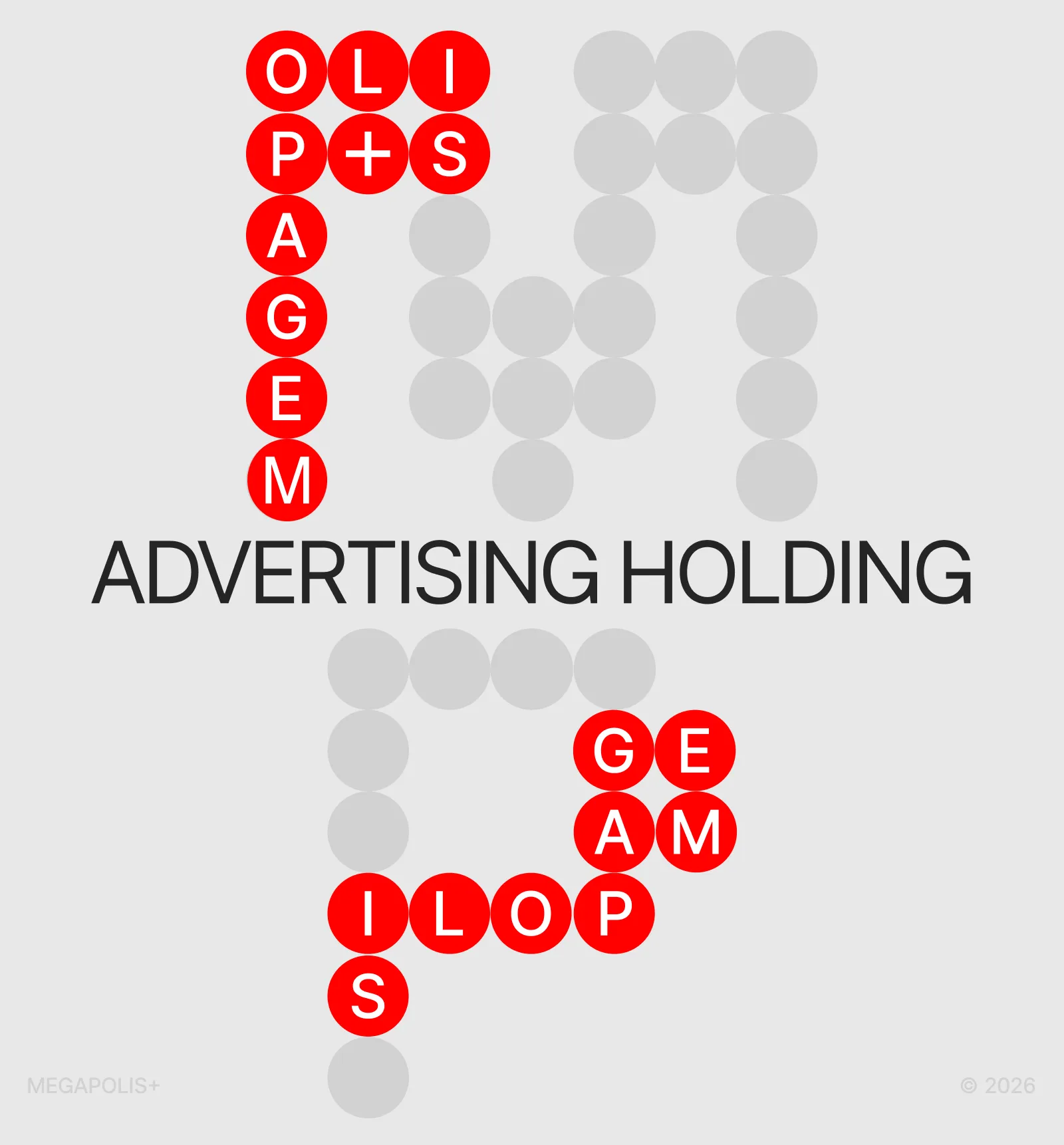
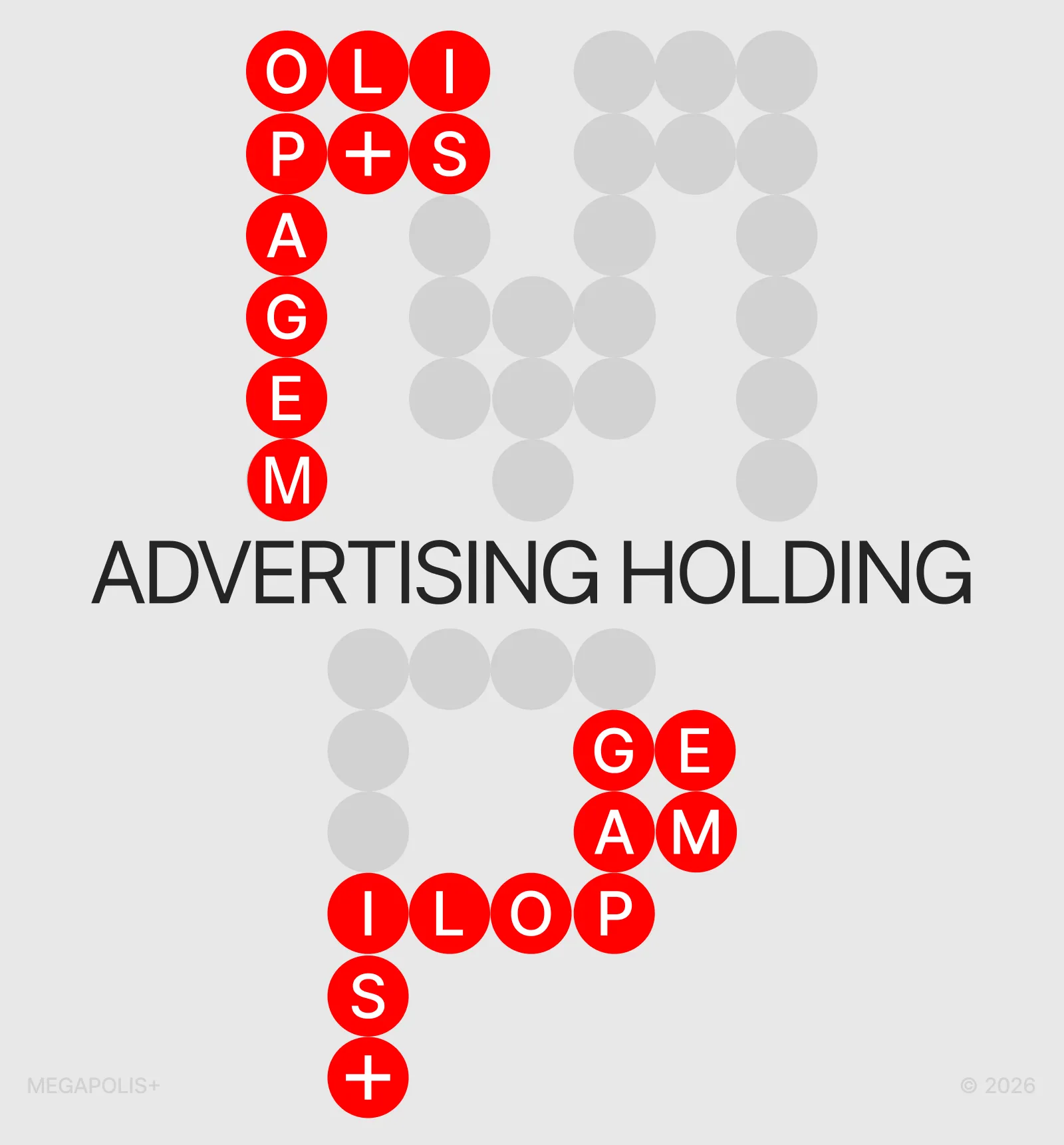
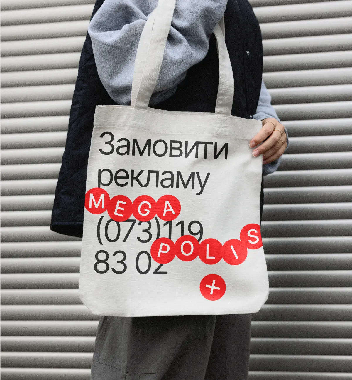
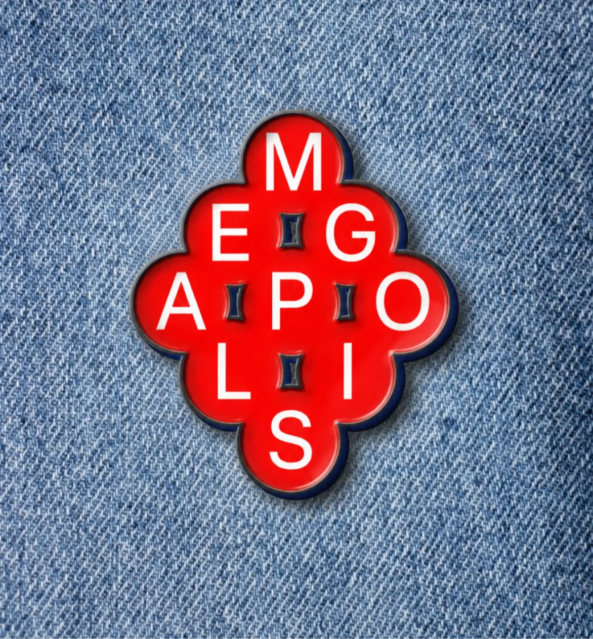
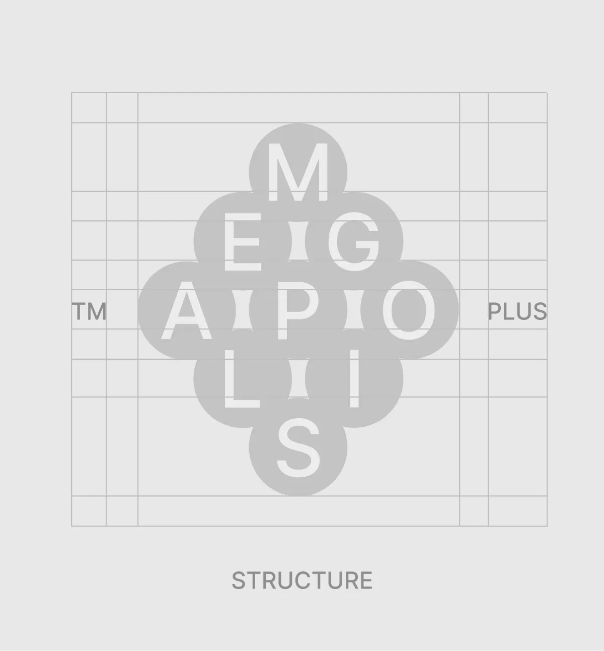
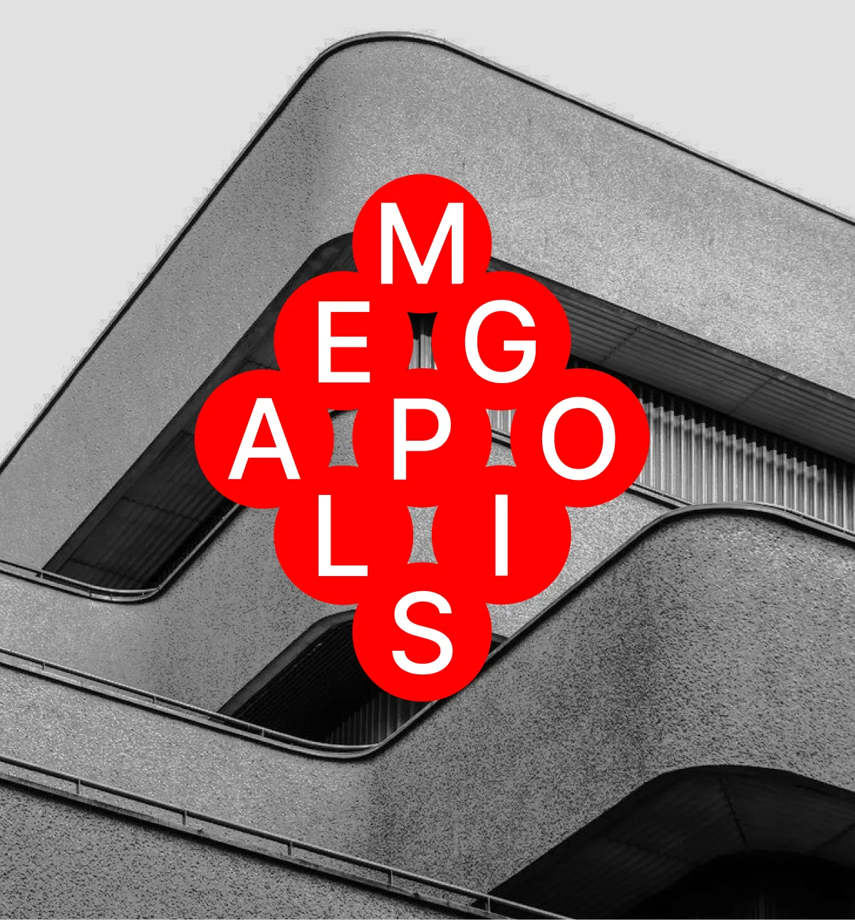
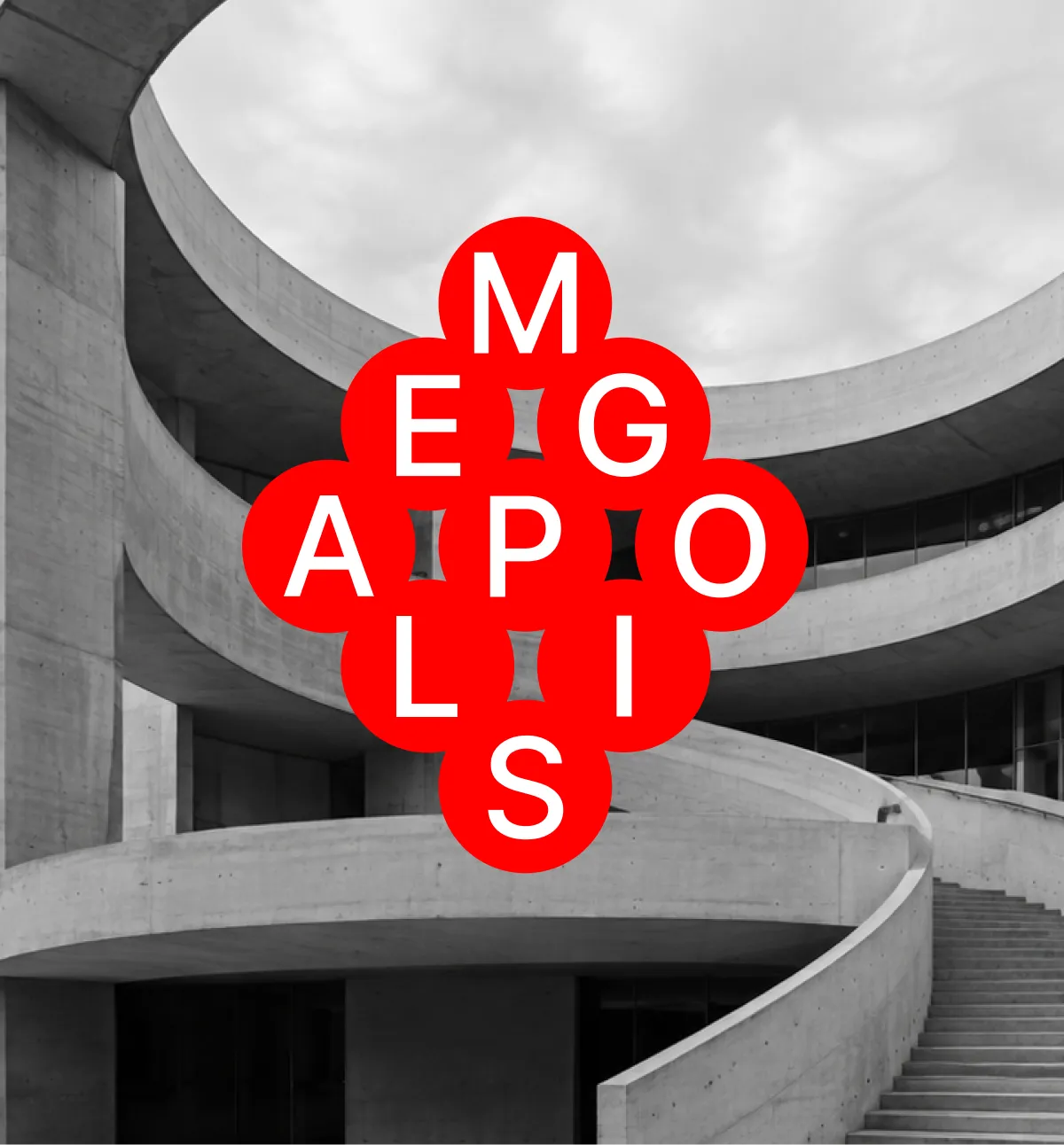
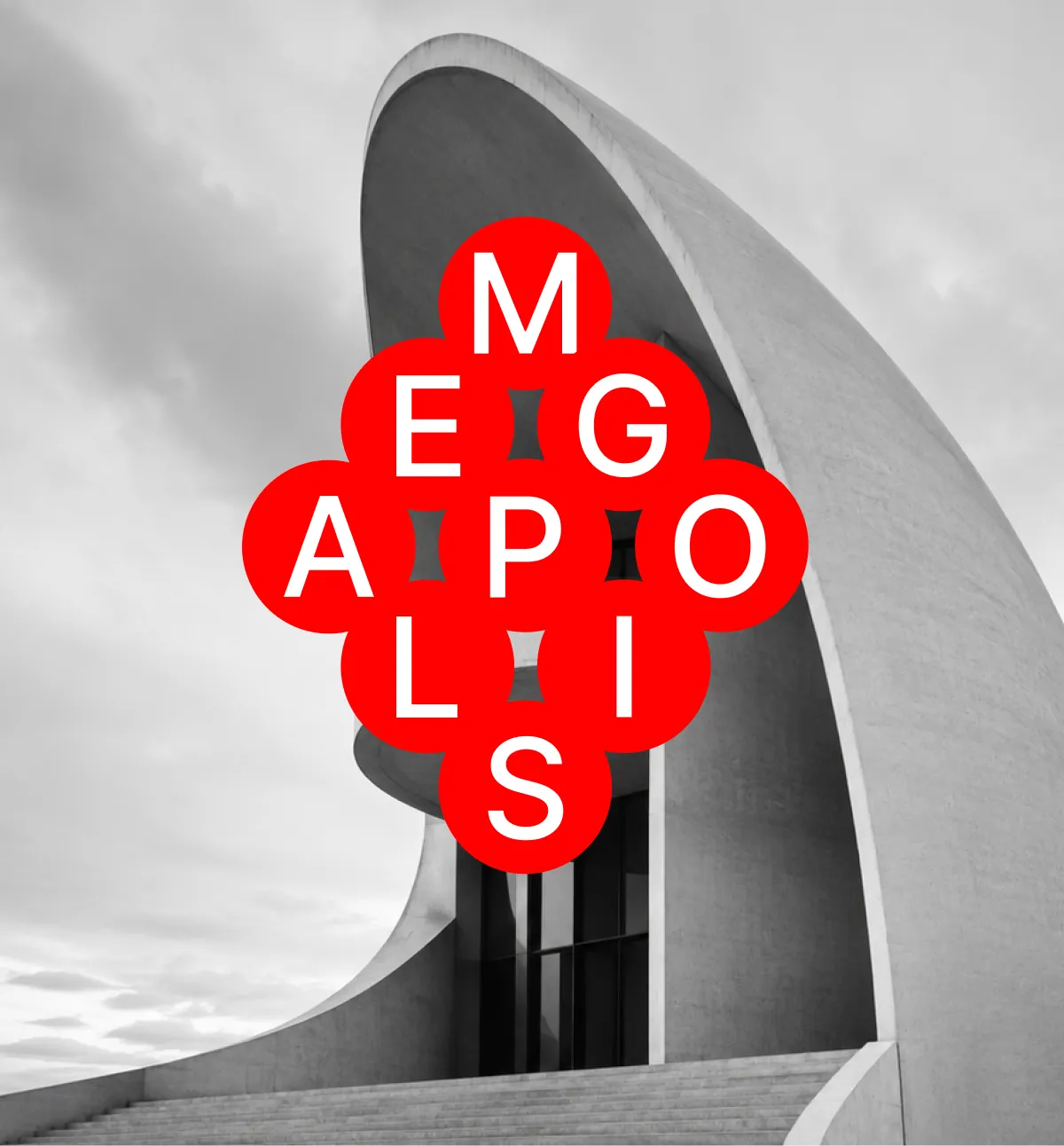
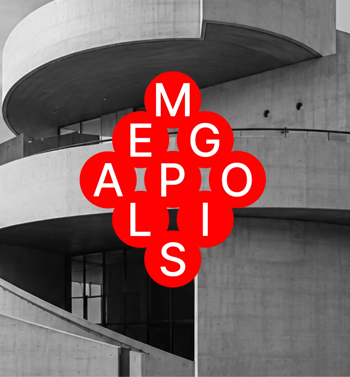
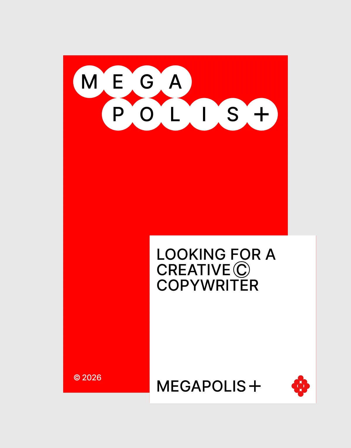
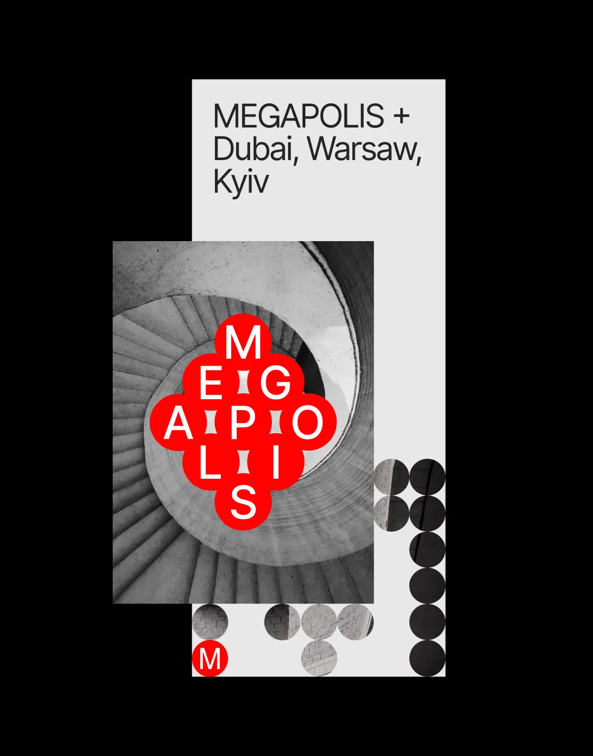
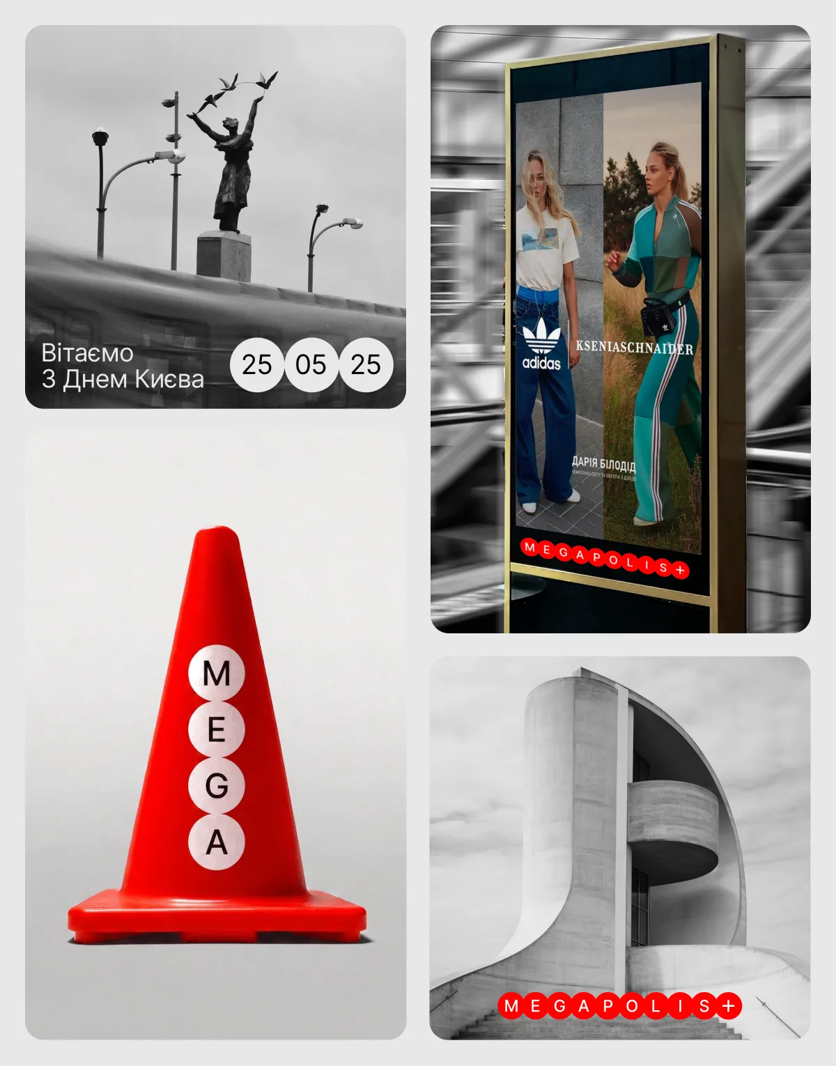
The logo is inspired by the flexible geometry of Constructivism. Its form adapts to different spaces and formats, transforming and organising them.
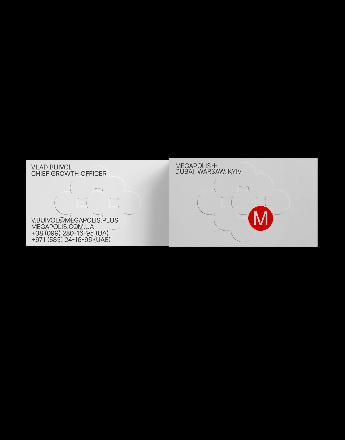
Colour and form unite all elements of the identity into a cohesive system that conveys the brand’s urban, contemporary, and dynamic character.


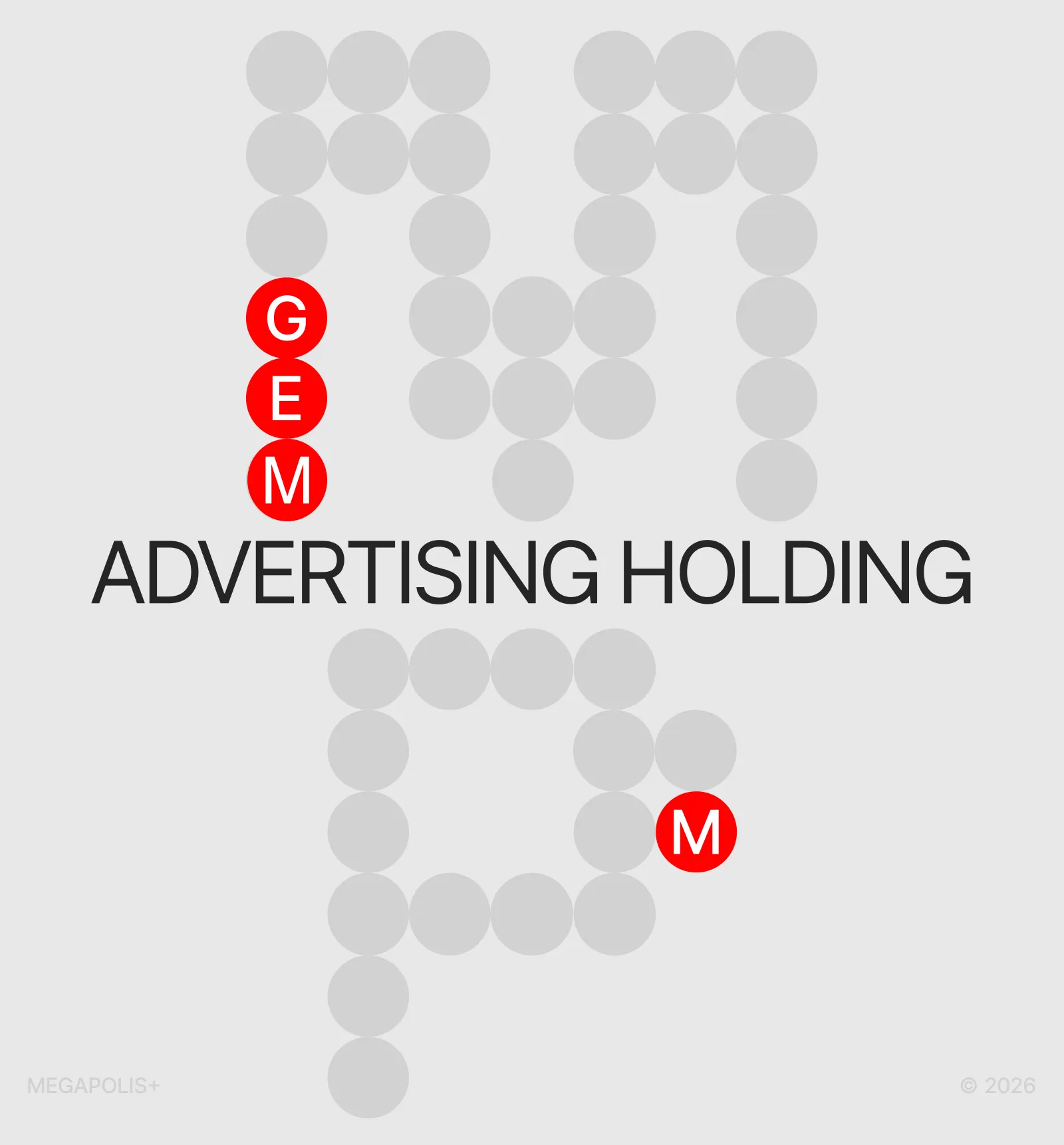
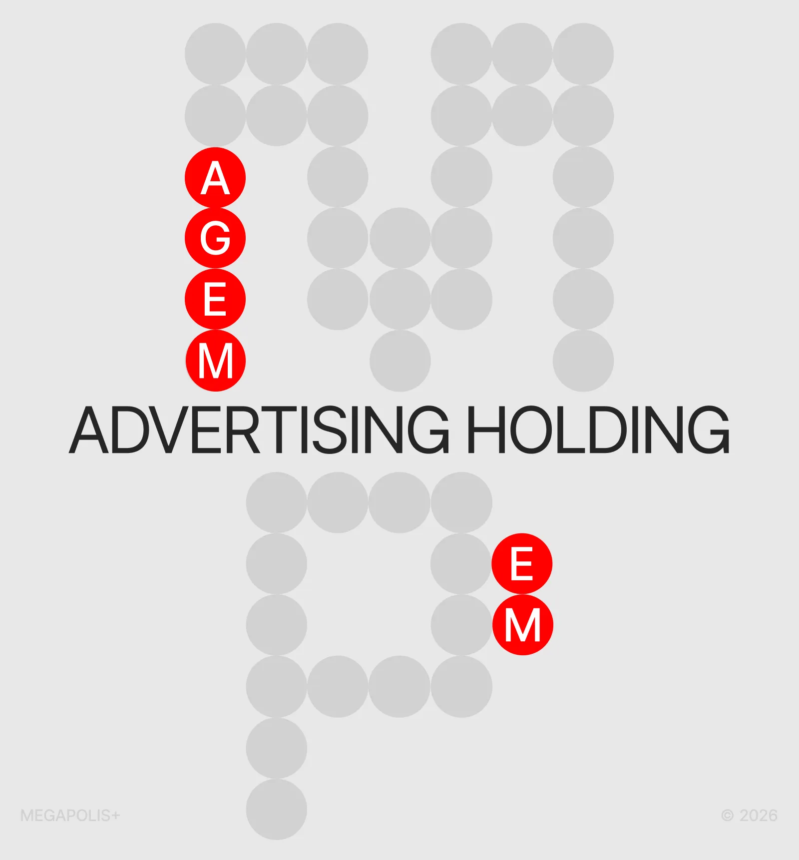
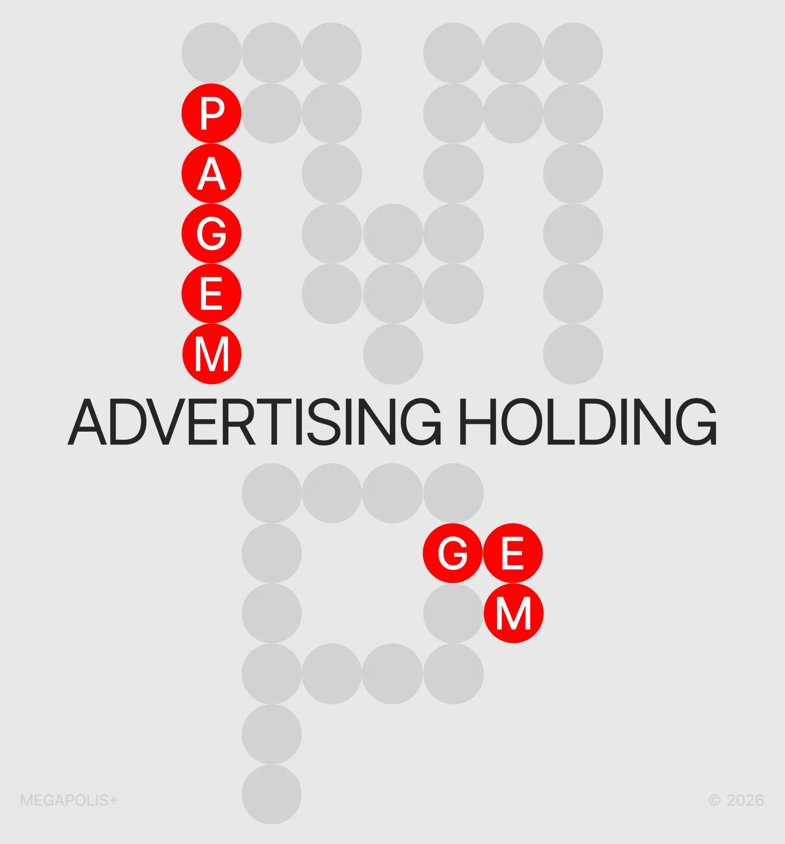
- MOTION
The motion system reflects the brand’s extensive work with physical objects without attempting to reproduce their volume literally. The graphics therefore remain flat and two-dimensional.
At the same time, the graphic forms take on physical properties: they can be scattered, collided, compressed, and distorted. This behaviour conveys the identity’s adaptability, flexibility, and organic character through motion.